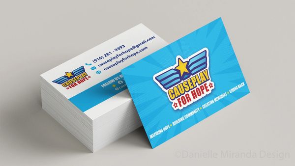
CAUSEplay for Hope
CAUSEplay for Hope brings activities and costumed characters to local hospitals and community events, providing a fun and safe environment for children to play and engage with their peers.
Project Deliverables:
- Brand Redesign -
- Logo -
- Business Cards -
- Additional Stationary -
- Member Badges -
- Brand Guidelines -
- Website Design -
Logo & Concepts

Concepts
The original logo (League for Hope) was styled off of a old school comic book super hero logo. It's scew and font offered playful tones. We wanted to carry those attributes to the new logo.
The elements of wings into the design was to draw in the meaning of "hope" and to "lift up those around you". Wings are also heavily used in modern super hero logos.
Many of the concepts used similar color to the original logo. This was to keep brand awareness since the name of the company changed. By keeping the color, the new logo stays familiar to the consumer.

Final Logo
The Final logo for CAUSEplay for Hope was the one found to be the closest concept to the original design. This updated concept pays homage to classic comic book styles, and stays playful, much like the original.
The logo was completed with 3 versions for final use so the end client does not need to make alternations for their designs.


CAUSEPLAY FOR HOPE - BRAND Guidelines


CAUSEPLAY FOR HOPE - Website (causeplayforhope.com)


